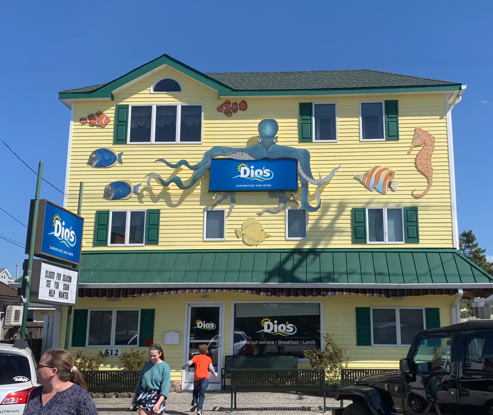
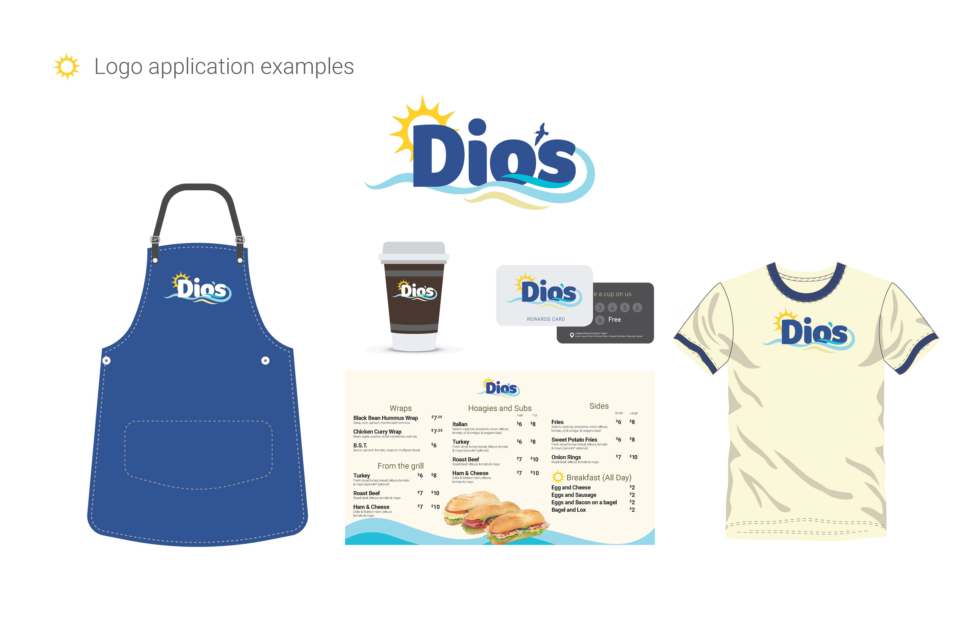
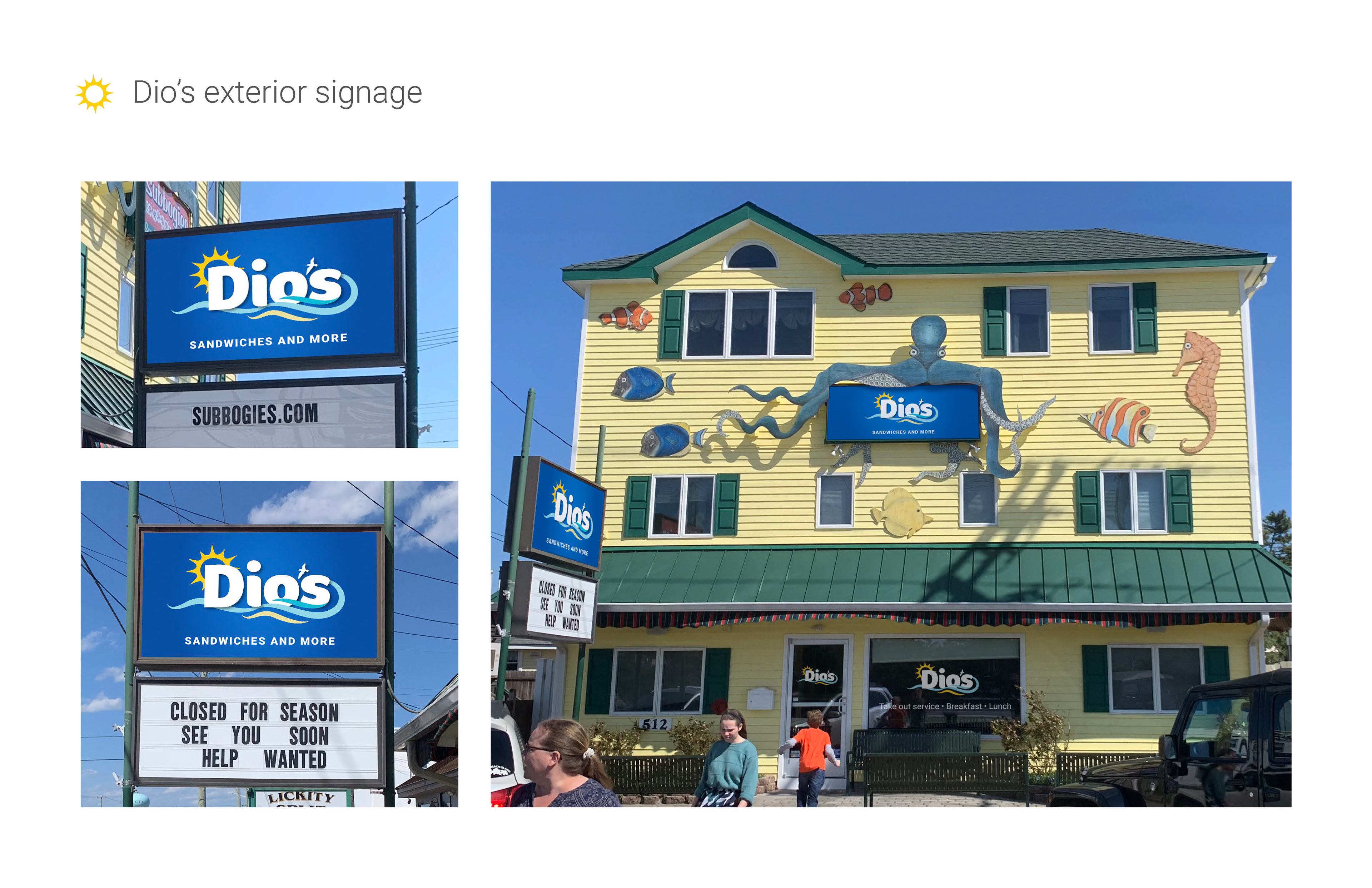
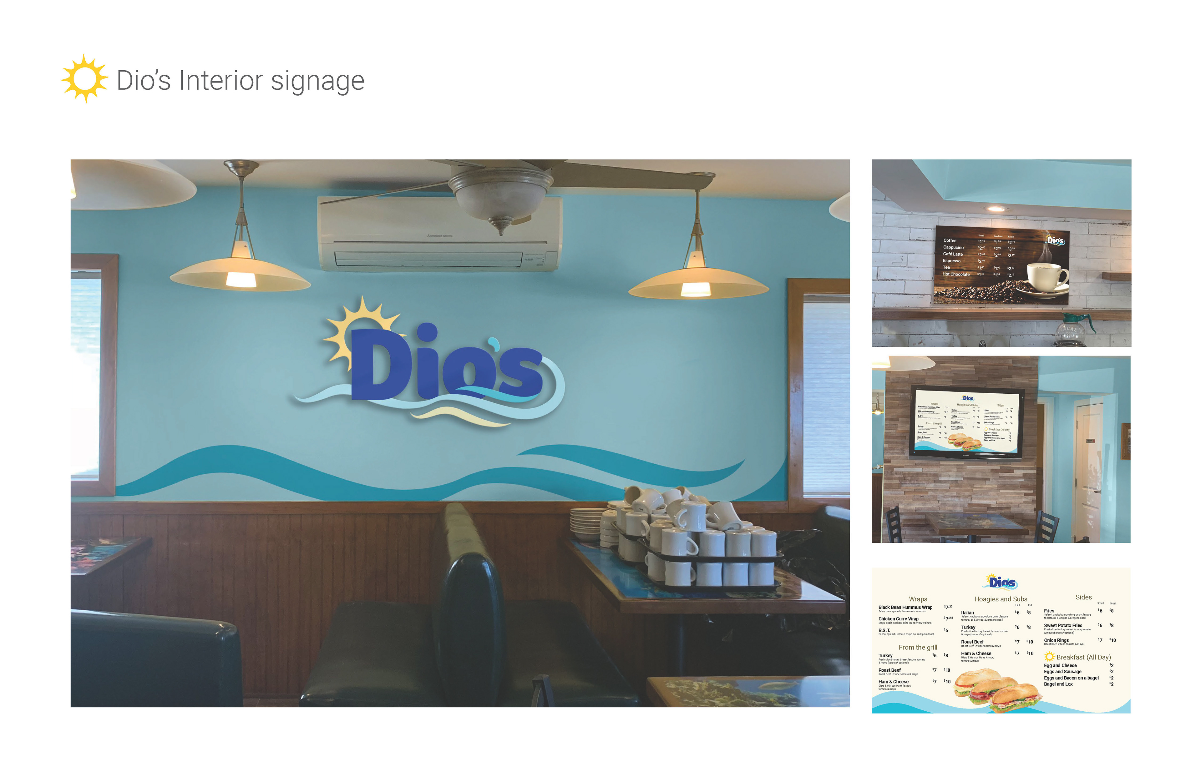
To align Dio’s brand with its Surf City environment, I explored visual cues from the shop’s existing tentacle mural. Translating those shapes into clean, wave-like forms allowed the logo to connect food, ocean, and local culture in one cohesive mark—memorable, flexible, and instantly recognizable.